
'Learn about Fiber Cement Siding' Articles
EXPLORE SIDING COLORS

SIDING PRODUCTS
COMMERCIAL SIDING
Top color trends for the exterior of homes in the Dallas-Fort Worth area
Choosing the right exterior paint color is more than just a matter of aesthetics; it can significantly impact your home’s curb appeal and value.
With the Dallas-Fort Worth area experiencing rapid development, understanding the trending colors can give homeowners an edge in creating an inviting atmosphere. The right shades can also reflect the unique architectural styles found throughout the region, making color selection a vital consideration.
As various factors such as lighting conditions, architectural style, and personal preferences influence color choices, it’s essential to navigate this complex landscape.
Colors not only serve a decorative purpose but evoke emotions and sentiments in those who view them. From timeless whites to bold reds, each hue carries its own psychological impact, affecting how the home is perceived within its neighborhood.
This article will explore the top trends in exterior paint colors specifically for Dallas-Fort Worth homes, providing insights into popular hues, their emotional resonance, and practical considerations regarding materials like James Hardie's Fiber Cement Siding Products.
Whether planning a refresh or a complete home makeover, understanding these trends can help homeowners make informed decisions that enhance both beauty and functionality.
What are the most popular color choices for a house's exterior?
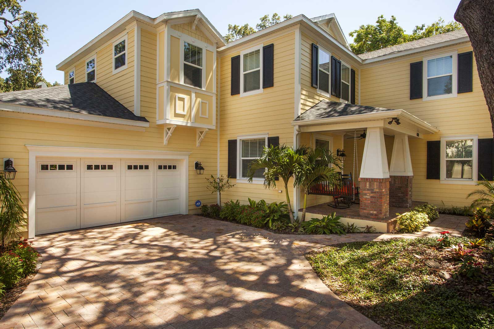
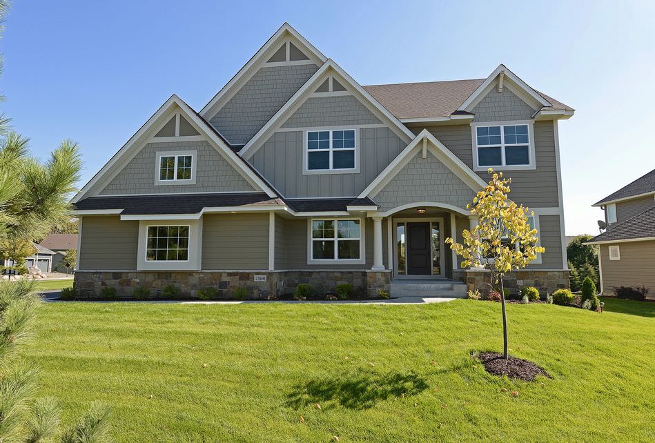
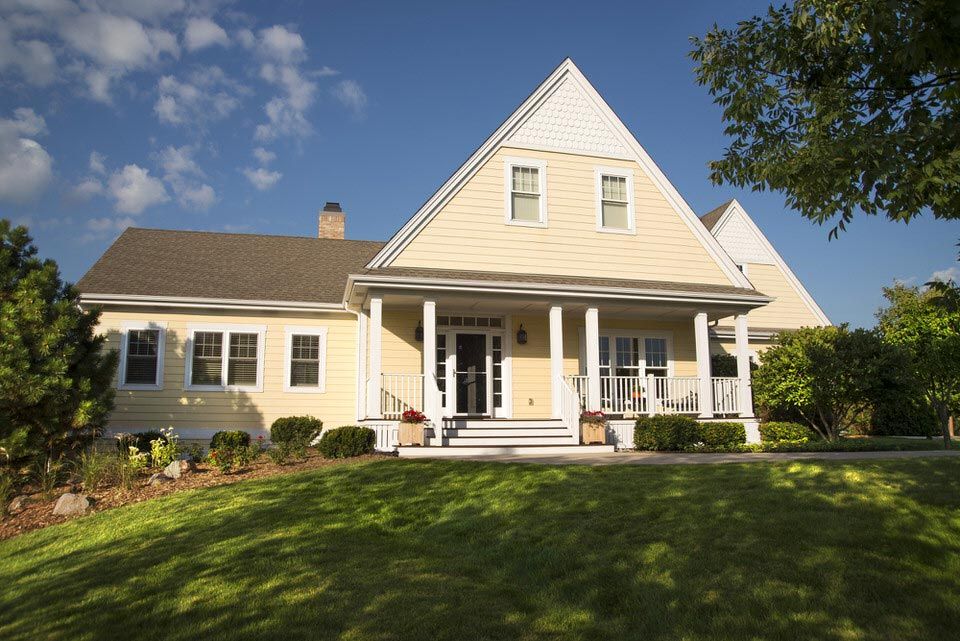
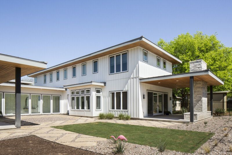
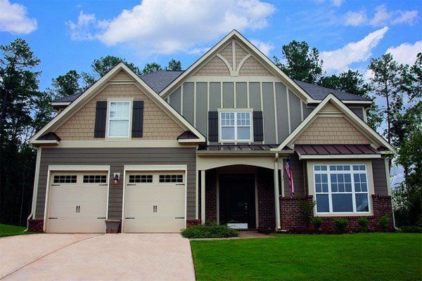
When considering the most popular color choices for a house's exterior in the Dallas-Fort Worth area, homeowners often opt for a palette that complements the architectural style and provides a boost in curb appeal. Neutral colors, such as taupe, off-white, and pale yellow, are classic picks that offer a timeless charm and easy adaptability to various surroundings and personal styles.
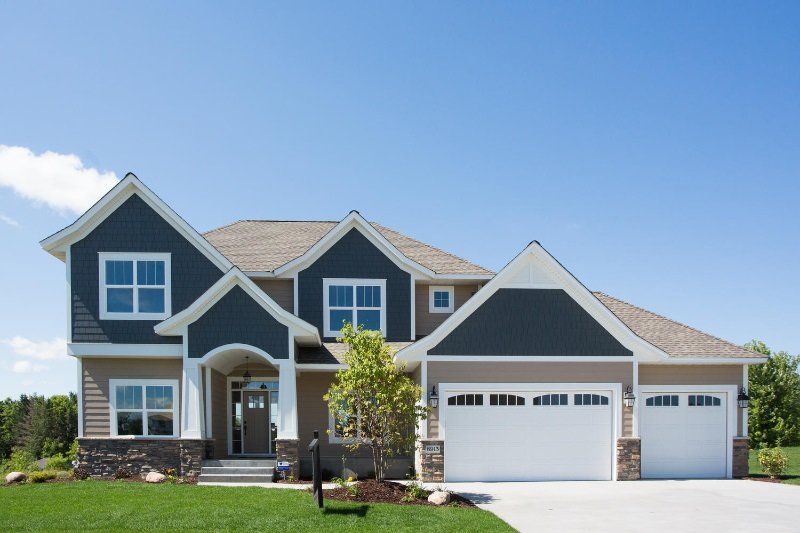
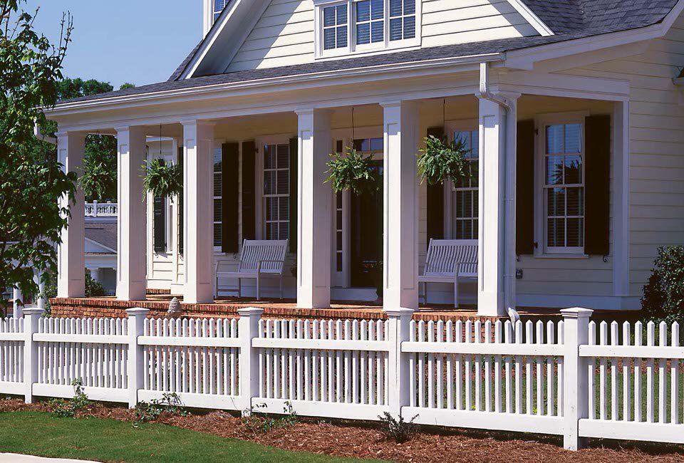
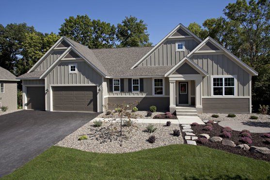
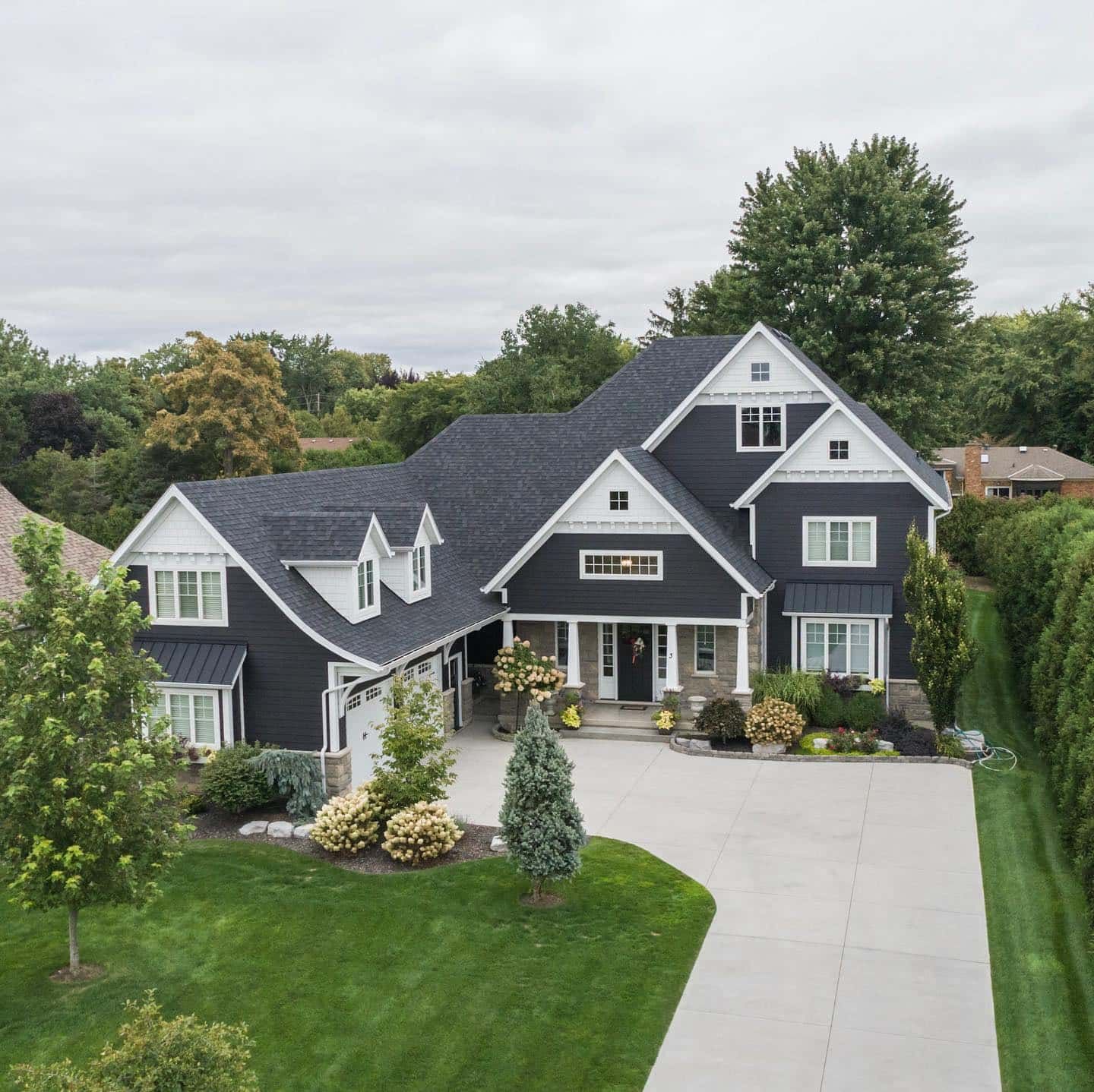
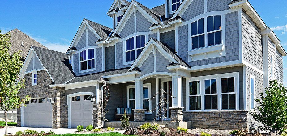
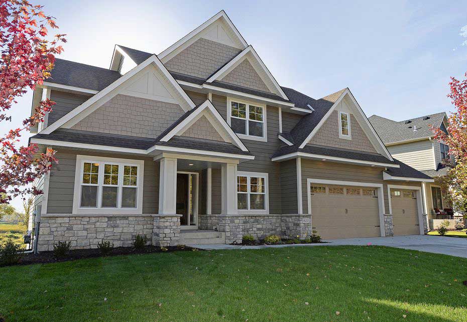
Gray remains a versatile and widely favored option, with many selecting dark gray paired with crisp white trim to achieve a striking visual appeal. This color scheme is not only popular but also adds a clean, fresh coat of drama to the property.
For traditional homes and those near waterfronts, blue is a recommended choice, bringing a serene and stately presence. In contrast, green is particularly fitting for homes that are nestled among lush green landscapes, providing a cohesive look with nature.
Furthermore, for those looking to add a modern edge or a pop of contrast, blacks and darker shades serve as excellent choices for accents and trims. These darker colors can define architectural features and lend a bold, sophisticated touch to the exterior color scheme.
Popular Exterior Paint Colors:
- Neutral Tones:
- Taupe
- Off-white
- Pale yellow
- Gray:
- Dark gray with white trim
- Blues:
- Recommended for traditional and waterfront homes
- Greens:
- Suitable for naturistic surroundings
- Accents:
- Black and dark tones for trims and accents
What feelings are evoked when looking at a house painted white?
The exterior color of a home has a profound impact on the emotions it evokes. A house painted white can often stir feelings of serenity and simplicity. With its classic and timeless appeal, white exteriors exude a sense of cleanliness and order, suggesting a well-maintained and cherished home.
Looking at a house painted in this hue can also convey openness and spaciousness, as white has the visual effect of making properties appear larger. The pure backdrop of a white house allows for a creative canvas where vibrant trim, sophisticated furniture, and tasteful outdoor decorations can stand out, thereby enhancing the property's curb appeal.
Furthermore, white reflects a sense of sophistication and flexibility. It is a color that can easily adapt to any architectural style, conveying an elegant and refined atmosphere.
Whether aiming for a vintage ambiance or a fresh, modern look, the feeling that white paints inspire is one of endless possibilities and a welcoming warmth that beckons guests and onlookers alike.

- Feelings Evoked by a White Exterior:
- Serenity
- Cleanliness
- Spaciousness
- Sophistication
- Elegance
White is also versatile as it pairs well with many colours.
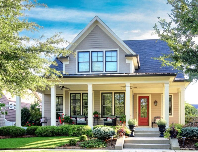
What feelings are evoked when looking at a house painted red?
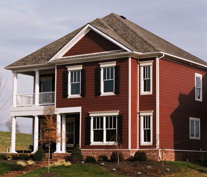
A house painted in a vivid shade of red can stir a range of emotions and sensations, influencing the curb appeal and setting a distinctive tone for the residence.
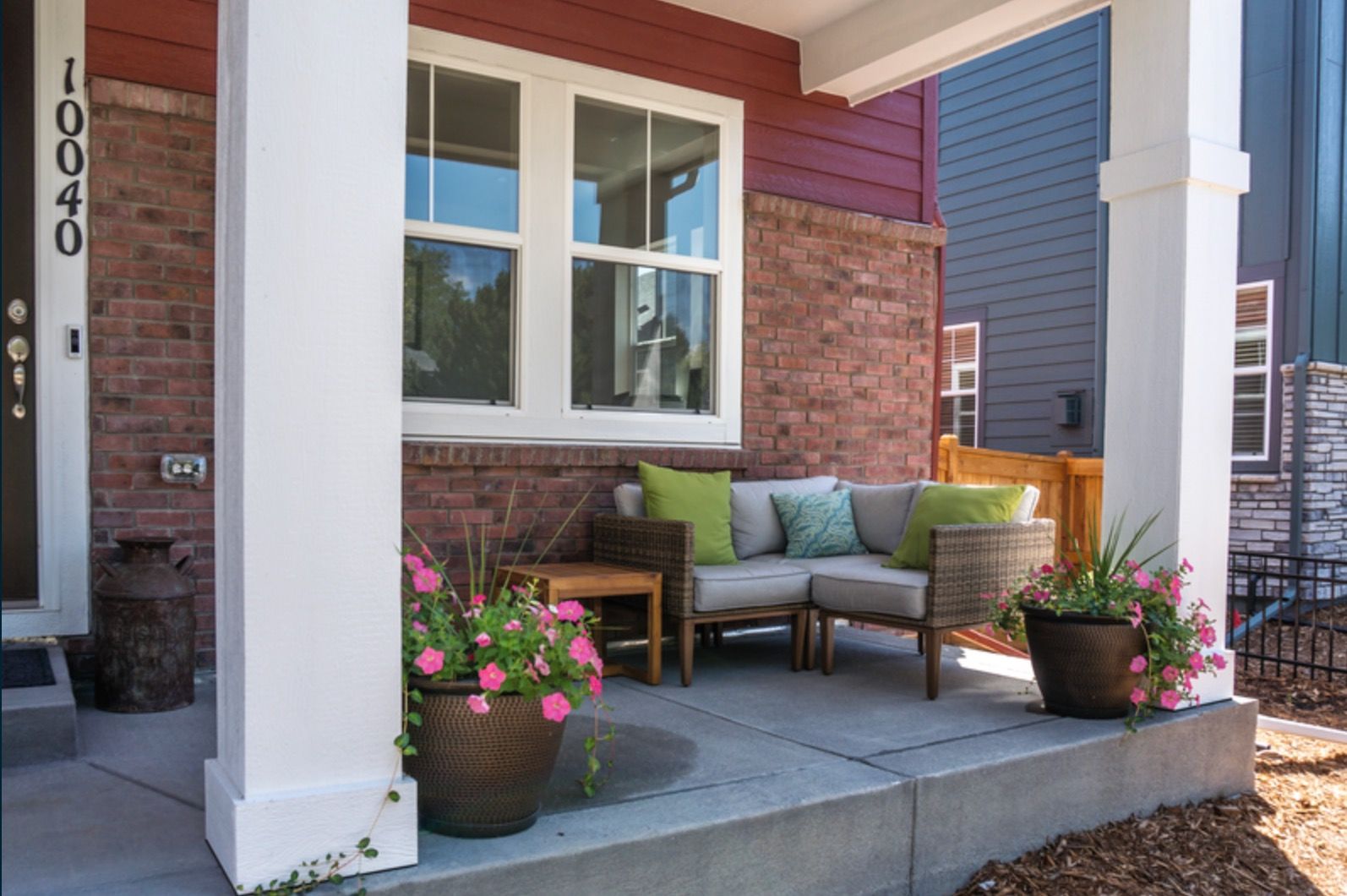
Red as an exterior color is traditionally associated with a welcoming and warm ambiance. When a home boasts this striking hue, it exudes a sense of cheerfulness and hospitality that can be felt from the sidewalk.
Red paint applied to the exterior makes a property pop out from its surroundings, whether that's lush greenery or a more urban backdrop.
This bold choice in color serves to draw attention in a confident manner, ensuring the house stands out—an effective technique especially in a neighborhood where muted tones may prevail.
Opting for a lighthouse red provides a classic yet fresh visual appeal, striking a balance between timeless elegance and a contemporary edge.
The radiant energy of red lends a dynamic and passionate quality to the home's appearance, suggesting a lively and spirited lifestyle within.
The emotions evoked by a red-painted house are as follows:
- Vibrancy and Energy
- Tradition and Warmth
- Appeal and Distinction
- Elegance and Modernity
Understanding the psychological impact of red, homeowners might choose this color to craft an exterior that's as emotionally engaging as it is visually appealing.
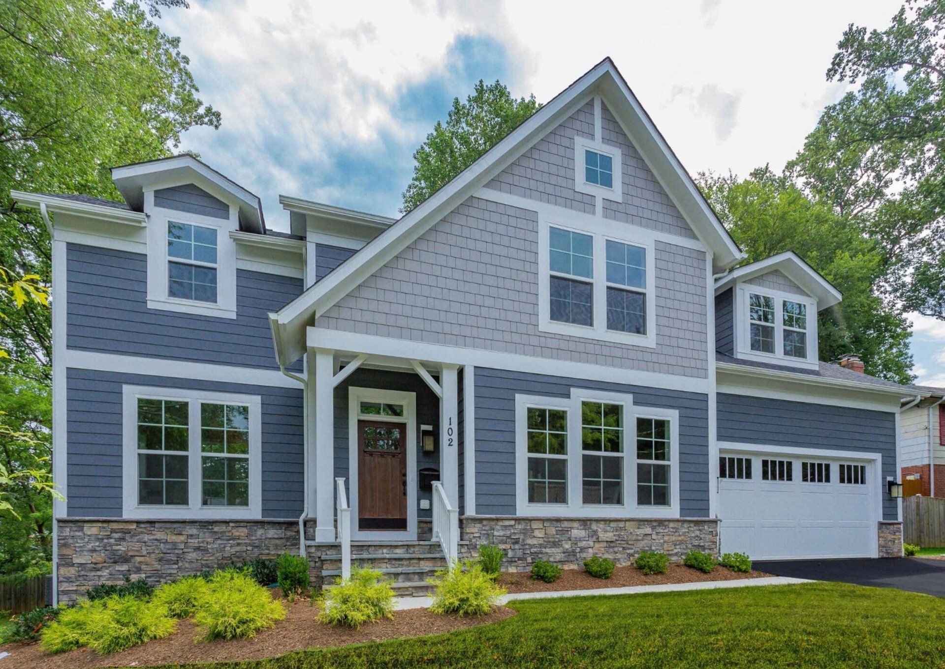
What feelings are evoked when looking at a house painted gray?
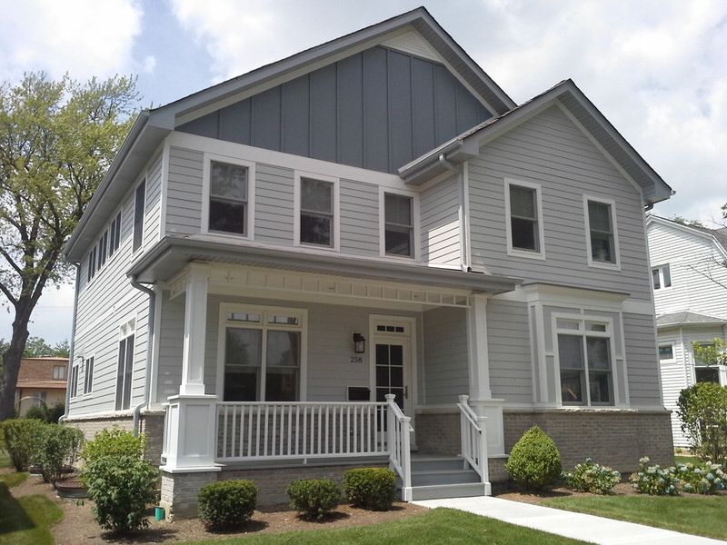
Gray exterior paint has become a favored option for homeowners due to its ability to embody sophistication and tranquility.
Homes adorned with dark shades of gray resonate with a sense of security, offering a refuge for dwellers and a haven from the outside world.
This darker color choice aligns well with the need for comfort and safety in uncertain times.
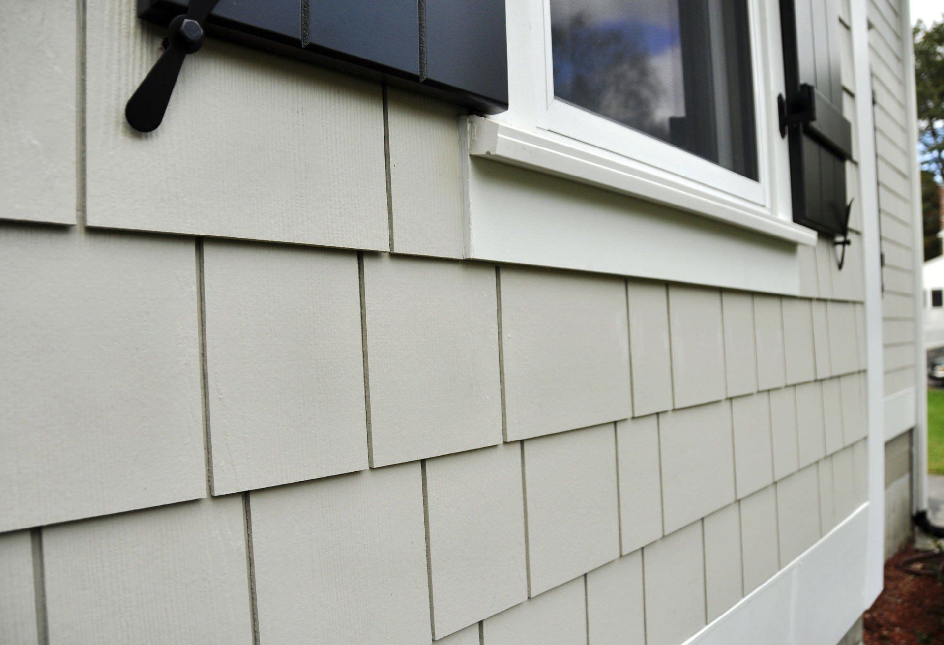
On the other end of the spectrum, lighter grays maintain a subtle charm. These neutral colors are incredibly adaptable, catering to a wide range of personal tastes and enhancing the marketability of properties in diverse locales.
When paired with white trim, a coat of paint in a gray undertone strikes a delicate balance, accentuating a home’s architectural style without overpowering it. The result is a refined and stylish visual appeal.
Cool grays and light-blue grays stand out on the color wheel for their compatibility with a variety of accent colors, offering homeowners the opportunity to add a pop of color.
This versatile palette supports a visual appeal that is not only contemporary but also versatile, appealing to a broad audience.
What feelings are evoked when looking at a house painted beige or taupe?
Beige and taupe have emerged as popular choices for exterior paint colors in home design, especially for their ability to evoke a range of emotions. When observing a home painted in these hues, one tends to feel a sense of warmth and comfort, attributed to the inviting warm undertones that beige carries. This feeling of reassurance can influence potential buyers positively, creating a welcoming atmosphere.
The palette of taupe, often considered fresh and modern, induces feelings of versatility and modernity. It suggests that the homeowners are in touch with current trends while maintaining a classic appeal.
Both colors, known for their tranquil and serene qualities, resonate with the desire of homeowners to create a harmonious connection with the natural surroundings, making the exterior of the home an extension of the outdoors.
Utilizing lighter shades like beige and taupe can also make spaces appear more open and brighter. This effect can foster feelings of positivity and neutrality, making these shades particularly appealing when considering the emotional impact on observers and potential buyers.
Overall, these colors lend themselves to a spectrum of emotional responses that contribute to their popularity in home exteriors.
What feelings are evoked when looking at a house painted sage green?
Sage green, a color reminiscent of Earth's tranquility, imbues the exterior of a home with a sense of calmness and serenity.
When applied to homes in the Dallas-Fort Worth area, this hue can significantly amplify a property's curb appeal, instilling a warm and inviting ambiance.
This color finds itself at home amid contemporary designs, where it delivers sophistication without sacrificing approachability.
Embracing sage green for a home's façade may mirror the homeowner's yearning for a peaceful retreat from the bustling city life, casting an allure for potential buyers in search of a cozy haven.
It’s a refreshing alternative to the bold colors and neutral tones typically found in residential exteriors.
Moreover, sage green's versatile nature allows for creative expression through contrasting accents. Trims in a creamy white or a subtle gray underline the color's earthiness whilst refining the architectural style.
These pairings elevate the home's visual appeal, offering an aesthetic that is both elegant and grounded.
A coat of paint in sage green thus promises not only a fresh look but also evokes an inviting lifestyle choice.
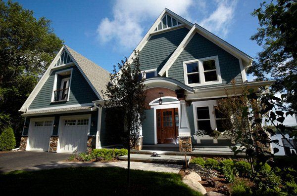
What feelings are evoked when looking at a house painted blue?
A house painted blue often evokes feelings of tranquility and calmness, making it an ideal choice for traditional homes and those located near the water.
The use of light blue shades can infuse the exterior with charm and warmth, inviting viewers with a sense of openness and hospitality.
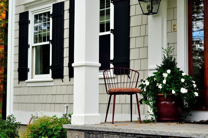
When blue is applied to exterior elements like shutters, it provides an alluring contrast with a white exterior, breaking up the monotony and preventing the house from appearing as a stark white block.
Incorporating blue as an accent color on windows or doors can significantly enhance the home's visual appeal. This strategic use of blue draws the eye to the key architectural features, offering a striking visual interest.
Whether used broadly or as a complement, blue can bring a fresh and serene vibe to a home's facade, aligning effortlessly with both modern sensibilities and classic aesthetics.
Overall, blue has the powerful potential to evoke serenity and freshness, leaving onlookers with a lasting positive impression.
What feelings are evoked in looking at a house painted a warm shade of blue?
In the vibrant community of the Dallas-Fort Worth area, where curb appeal is of essence, a house painted in warm shades of blue can have a profound impact on the emotions it evokes.
This color palette radiates an inviting warmth, ushering a sense of comfort and relaxation the moment one sets eyes on the home.
Varying from light to richer tones, warm blues envelop a house with tranquility, transforming it into a peaceful haven in the bustling environment.
The harmonious and serene ambiance created by such exterior colors appeals to those seeking respite and calmness in their busy lives.
Moreover, the sophistication and elegance of warm blue hues enhance the architectural style and add a unique charm, contributing significantly to the home's overall visual appeal.
This subtle yet profound use of color can create a lasting impression of well-being and familiarity, making a warm blue house a distinguished landmark in Dallas-Fort Worth neighborhoods.
What feelings are evoked when looking at a house painted black?
Homes with black exteriors have progressively gained popularity for their ability to evoke strong feelings and create striking curb appeal. Black, being a bold color, brings forth a modern and somewhat moody aesthetic that aligns with contemporary design trends.
Since 2017, platforms like Pinterest and Instagram have amplified this trend, showcasing the visual appeal of black homes and influencing homeowners' choices.
Black's impact is, however, highly susceptible to lighting conditions. Under the bright sun, black can appear softer and more inviting, while in shaded areas, it may present a more profound, dramatic effect.
Potential homeowners must remember that colors can deceive the eye, appearing much darker in low light conditions.
Therefore, when considering a coat of paint in this darker shade, one's personal style must align with the varied expressions that black exteriors convey throughout the day.
To ensure the desired outcome, it's advisable to test swatches at different times and on all sides of the home.
By assessing the interaction between the black paint and natural light, homeowners can anticipate the emotional resonance—whether commanding presence or an understated elegance—that a black exterior will project.
Lighting Conditions: Choosing Colors That Shine in the Sun
When selecting exterior colors for a home, the impact of lighting conditions on paint hues is paramount, particularly in the constantly changing Texas skies. In the Dallas-Fort Worth area, a color's vibrancy and tone can alter due to the home's orientation and exposure to sunlight.
North-facing homes tend to experience colors with a grayish or muted quality because these areas are often in the shade. Thus, it's wise to choose colors that can maintain their integrity without direct sunlight.
For south-facing exteriors in the Dallas-Fort Worth area, colors generally appear lighter. These homes bask in sunlight, so lighter shades will stand up well under the relentless Texas sun.
East-facing homes see their colors shift throughout the day; lighter and brighter in the morning, with a flatter tone by the afternoon.
This similarity to northern exposure by the afternoon suggests favoring hues that perform well in indirect light.
Westward orientations, however, flip this progression; starting with subdued tones early on, they are animated into warmth and brightness during the afternoon sun.
To optimize your choice for curb appeal:
- View paint swatches on each side of the home.
- Observe the shifting light from sunrise to sunset.
- Consider how various exposures affect your preferred palette.
A meticulously selected color scheme, tested across different times and lighting conditions, guarantees an exterior that radiates beauty regardless of the skies above Dallas-Fort Worth.
What exterior house colors lasts the longest?
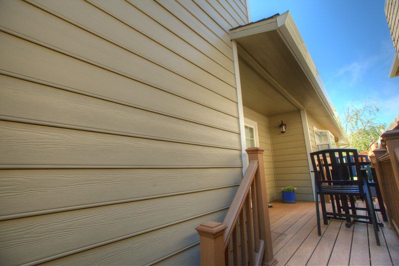
When selecting exterior paint colors for a home, longevity is a critical consideration. In the Dallas-Fort Worth area, neutral colors are renowned for their enduring qualities.
Colors such as whites, beiges, and taupes stand as popular choices due to their classic appeal that withstands the test of time.
These shades offer several advantages:
- They are less prone to fading under the intense Texan sun.
- They have a broad market appeal and can enhance the resale value of a home.
- They complement various architectural styles, providing versatility.
Soft white tones, in particular, are a prevailing recommendation for exterior paints. Their ageless attribute ensures that your home retains visual appeal over the years, avoiding the need for frequent repaints.
When choosing the right color, considering neighborhood rules and personal style is paramount, and balancing these with the potential for future marketability can help homeowners make an informed decision.
A fresh coat of paint in these neutral tones can significantly boost a home's curb appeal while promising longevity.
Remember that while fashion and personal taste might tempt homeowners to opt for bold or dark shades, it is the neutral colors that tend to offer the longest-lasting appeal on a home's exterior.
What exterior house colors help sell a house?
When selling a house, the exterior color can significantly impact its attractiveness and perceived value. Homes dressed in shades of blue, particularly light or gray-blue, are found to fetch higher prices, perhaps due to the tranquil and inviting vibe they emanate.
Neutral colors remain a steadfast choice; hues such as grays, beiges, and classic whites appeal to a wide audience, ensuring the property remains adaptable to any personal style.
For those properties nestled within natural landscapes, earth tones are highly beneficial. These colors harmonize with the surroundings, enhancing curb appeal and increasing selling potential.
Warm and bright colors resonate well with cottage-style homes, offering a cozy and inviting atmosphere that's attractive to buyers seeking a homely essence.
Lastly, there's a growing trend for darker tones like charcoal gray, especially in integral spaces like kitchens and living rooms—translating to the exterior can command higher prices.
Darker colors provide a sense of sophistication and can make white trim and accent colors stand out, further boosting a home's visual allure.
In summary, selecting the right color scheme mindful of the architectural style and incorporating it with the natural surroundings can make a significant difference in real estate appeal and value.
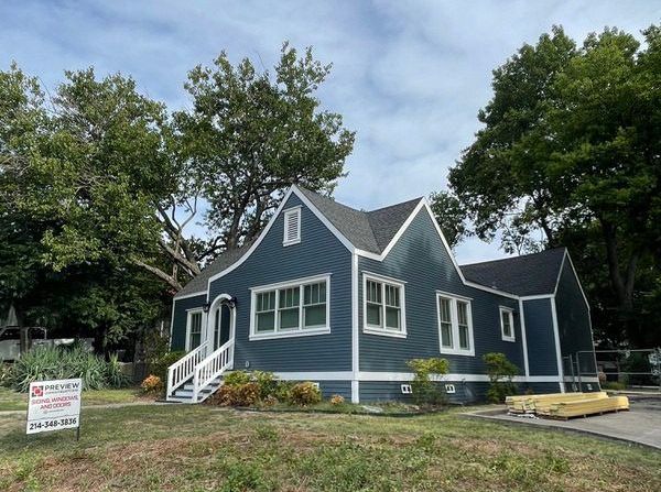
James Hardie® ColorPlus® siding colors that make a bold statement on the home's exterior in Texas
When selecting a bold statement for the exterior of a home, particularly in the Dallas-Fort Worth area, choosing the right color can significantly enhance the property's curb appeal.
A fresh coat of paint can transform a home's appearance, and the James Hardie® ColorPlus® siding offers a range of vibrant options that cater to personal styles and the architectural fabric of Texan homes.
If you're considering a bold choice, here's a list of James Hardie® ColorPlus® siding colors that can create a striking appearance:
- Deep Ocean: A profound and vibrant color that lends a touch of sophistication to any exterior.
- Aged Pewter: Perfect for those who prefer a darker shade with gray undertones.
- Iron Gray: A popular choice for a dark color scheme that complements white trim.
- Night Gray: Offers a dark base with the potential for contrasting accent colors.
- Countrylane Red: Provides a pop of color with a timeless and classic appeal.
- Evening Blue: Deep blues like this add visual appeal with a darker tone.
- Autumn Tan: A neutral tone that still maintains a bold presence.
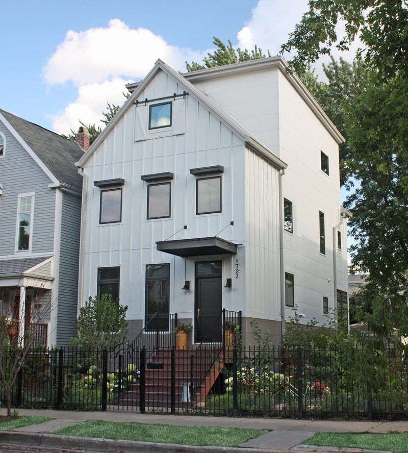
- Arctic White: A classic, crisp white that exudes modernity and freshness.
- Timber Bark: A dark gray that resonates with nature's darker colors.
- Heathered Moss: A gentle green that brings an organic touch to the exterior palette.
These colors, whether as the main hue or an accent, can add significant character to a home in the Dallas-Fort Worth area, erasing its architectural style and creating a fresh facade that stands out.
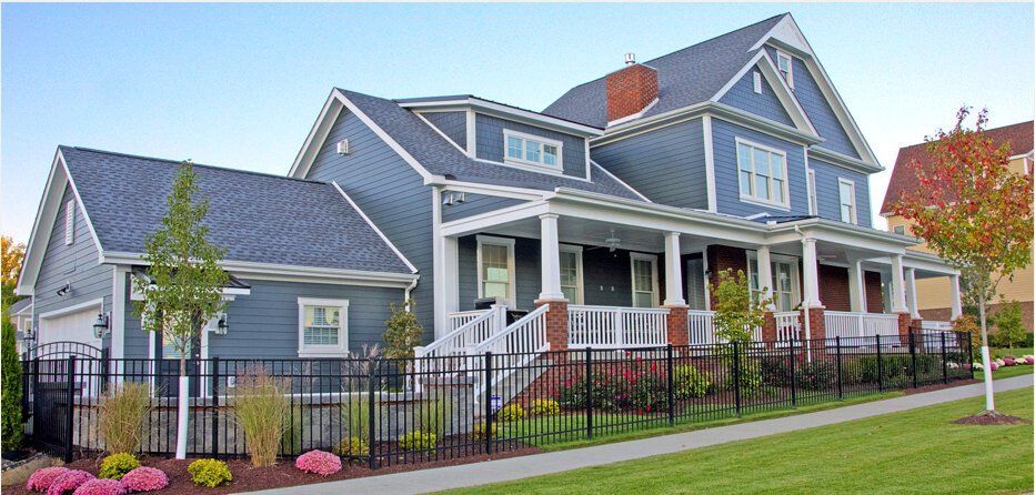
James Hardie® ColorPlus® siding colors that provide a timeless and elegant curb appeal for the home's exterior
The James Hardie® ColorPlus® siding range provides homeowners in the Dallas-Fort Worth area with an array of colors suited for creating a timeless and elegant curb appeal for the exterior of their homes.
When selecting a color, homeowners are encouraged to consider their personal style, the architectural style of their domicile, and the surrounding environment to ensure the chosen hues harmonize with the local aesthetic.
Here are select James Hardie® ColorPlus® siding colors known for their enduring appeal:
- Pearl Gray - A soft, soothing gray with undertones that offer a fresh and serene look.
- Boothbay Blue - This deep blue provides a bold yet stately presence, reminiscent of classic Americana.
- Autumn Tan - A neutral tone that echoes natural elements, giving a warm, inviting feel.
- Cobble Stone - A blend of taupe and gray, perfect for achieving a sophisticated and neutral backdrop.
- Arctic White - Clean and crisp, creating a bold contrast when paired with darker shades for trim or accent colors.
- Night Gray - A darker shade of gray that adds drama and depth, making it a popular choice for modern homes.
Each color is finished with James Hardie®'s durable ColorPlus® Technology, ensuring longevity and resistance to fading in the varied climate of the Dallas-Fort Worth area.
Architectural Styles: Matching Colors to Your Home's Design in the Dallas-Fort Worth area
In the Dallas-Fort Worth area, tailoring exterior paint colors to the architectural style and neighborhood aesthetic is essential for creating a harmonious and appealing look.
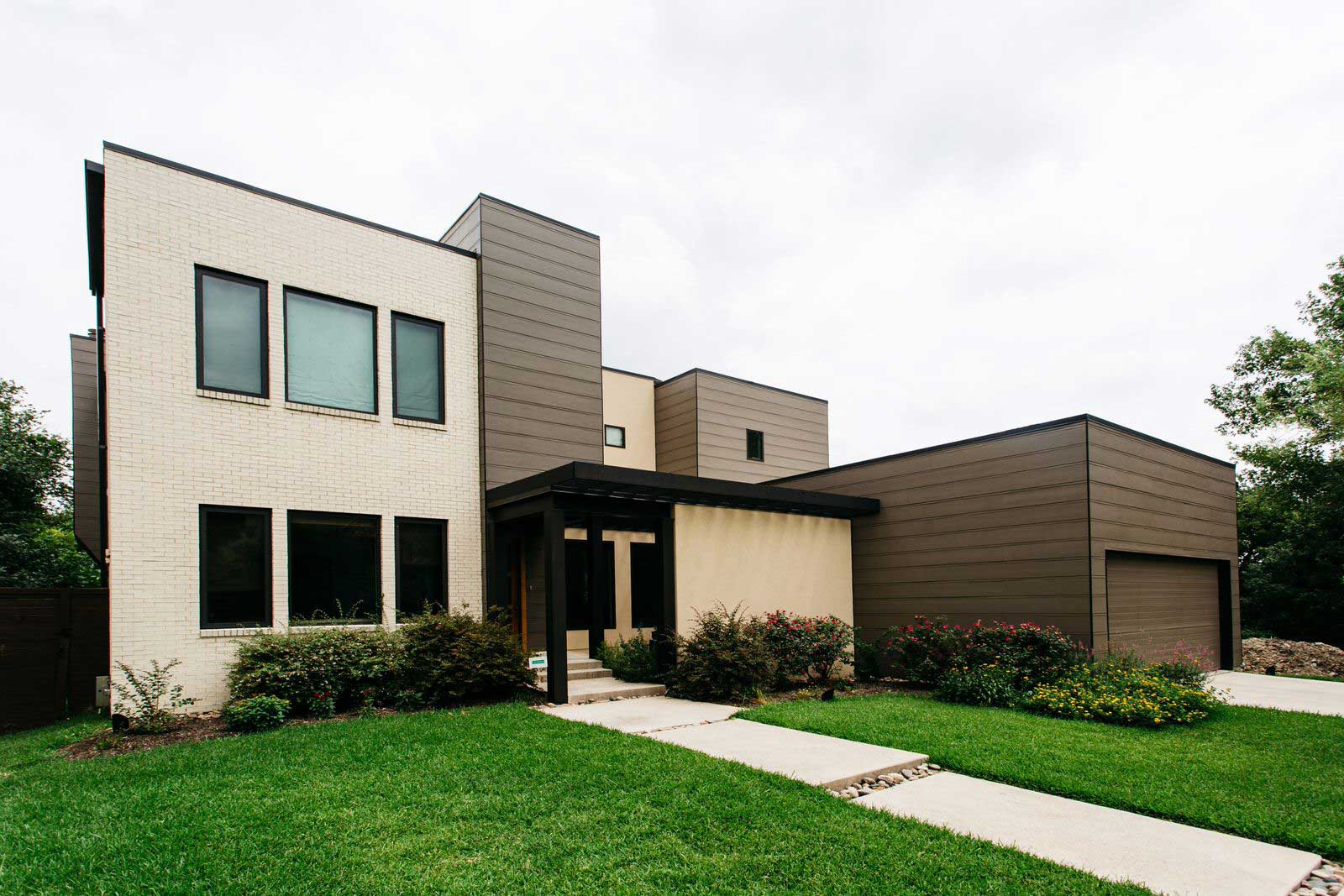
For example, historical homes may suit a palette of classic whites and creams, perhaps adding a pop of color with a deep red or navy blue on the front door for an elegant contrast. Meanwhile, modern homes in the area can make a statement with bolder choices, such as dark gray with white trim, a popular choice that matches fresh and contemporary designs.
To align with the local vibe, accent colors play a pivotal role. They add personality and curb appeal without overwhelming the primary color scheme.
Here are some popular color combinations often seen in Dallas-Fort Worth:
- Traditional: Beige with deep blue accents
- Contemporary: Dark gray with crisp white trim
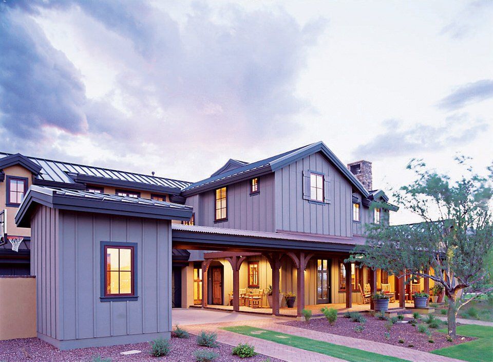
- Ranch-style: Warm neutrals with deep red accents
- Craftsman: Earthy greens with wood undertones
Each choice contributes to the visual appeal, adding a fresh coat of personality and style that respects the neighborhood's character. Selecting the right color wheel options for your exterior can elevate curb appeal while showcasing your personal style.
What are the top color trends in Dallas-Fort Worth Texas for exterior home paint colors?
In the vibrant Dallas-Fort Worth area, homeowners are embracing color trends that not only enhance curb appeal but also reflect their personal style.
The use of dark blues is on the rise, with hues such as navy, cobalt, and ultramarine gaining popularity. These deeper shades provide an elegant contrast when paired with white trim or other lighter accent colors, delivering a bold and sophisticated visual statement.
Additionally, the area is witnessing an inclination toward pale greens, including sage, sea foam, and mint. These colors offer a breath of fresh air and evoke the refreshing feel of early spring, resonating with a sense of renewal and nature-inspired aesthetics.
With a focus on accentuating the unique architectural style of each home, residents are also experimenting with multiple exterior colors. This strategy adds complexity and depth to the visual appeal of their properties.
Neutral tones remain a classic and popular choice, catering to the desire for tranquility in the home's exterior.
These shades blend seamlessly with the outdoor environment, creating a peaceful and welcoming exterior color scheme.
Trends in Dallas-Fort Worth Exterior Home Paint Colors:
- Bold Colors: Deep blues like navy and cobalt
- Refreshing Tones: Pale greens such as sage and mint
- Accentuation: Use of multiple colors to highlight architecture
- Neutral Shades: Serene tones for a tranquil exterior
These trends reflect the Dallas-Fort Worth homeowners' pursuit of balance between statement-making aesthetics and harmonious living environments.
What are the timeless, beautiful color choices for exterior paint colors in the Dallas-Fort Worth, Texas region?
When selecting the perfect exterior paint colors for homes in the Dallas-Fort Worth area, timeless and beautiful choices are key to ensuring lasting curb appeal.
Neutral shades such as white, beige, or gray provide a classic and enduring backdrop, perfectly aligning with the architectural style prevalent in the region.
These neutral tones serve as a versatile canvas, allowing homeowners to easily apply a fresh coat of paint or add bold accent colors for a personal touch.
For those seeking a sense of tranquility and freshness, soft blues and greens are ideal, reflecting the natural beauty of Texas landscapes.
These colors offer a pop of color that is subtle yet impactful, enhancing the visual appeal of the property.
Recently, there's been a noticeable trend toward darker shades, such as forest greens and navy blues—colors that add a sophisticated edge to the exterior color scheme.
These dark colors, often with gray undertones, are especially popular choices offering a modern twist to traditional design.
Balancing individual style with neighborhood harmony is essential.
Homeowners strive to select colors that stand out yet complement the surrounding homes, fostering a cohesive and attractive community aesthetic.
Popular Exterior Color Trends in Dallas-Fort Worth:
- Timeless Neutrals: White, Beige, Gray
- Fresh Tones: Soft Blues, Gentle Greens
- Bold Elegance: Dark Forest Greens, Navy Blues
By considering these color trends, homeowners can enhance the curb appeal of their homes, whether through a touch of white trim against dark gray or a darker shade that boldly asserts its presence in the neighborhood.
Top exterior home colors
In the Dallas-Fort Worth area, homeowners favor exterior colors that enhance curb appeal while reflecting their personal style. Trends indicate a preference for timeless neutrals such as whites, beiges, and taupes.
These neutral tones serve as a versatile foundation, suitable for various architectural styles and ensuring lasting visual appeal.
Gray, particularly dark gray, has emerged as a popular choice, attributed to its sophistication and the secure ambiance it provides. When paired with white trim, it accentuates a home's architectural details, contributing to a noteworthy first impression.
For those seeking a fresh coat with more character, deep blues and dark shades with gray undertones offer a bold statement. These darker colors, while striking, still maintain the elegance that discerning Dallas-Fort Worth residents desire.
Incorporating a pop of color, homes often feature accent colors on doors or shutters. This practice adds dimension and personality to the exterior color scheme.
The table below highlights popular exterior paint color choices in the area:
| Color | Tone | Usage |
|---|---|---|
| Gray | Dark | Main body |
| White | Bright/Neutral | Trim and accents |
| Blue | Deep | Main body or accents |
| Beige | Neutral | Main body |
| Pale Yellow | Soft | Main body or accents |
By selecting the right color scheme, a fresh coat of paint can elevate the curb appeal of a Dallas-Fort Worth home significantly.
Choosing between ColorPlus® and primed siding depends on whether the homeowner values convenience and durability or customizability and the ability to match the exterior precisely to their desired vision.
Video
Discover the distinctions between selecting ColorPlus or primed siding, drawn from our extensive experience over decades in residential home applications.
Getting help to choose the best colors for your home's exterior.
Choosing the right color for your home's exterior in the Dallas-Fort Worth area is vital for enhancing curb appeal and reflecting personal style.
A James Hardie® preferred contractor, such as Preview Construction LLC, brings a wealth of knowledge and expertise in selecting optimal colors that resonate with both the house characteristics and community preferences.
Working with a contractor like Jason Huffenberger, who specializes in color consultations, can be invaluable. He can guide you through a nuanced color selection process, ensuring that the exterior paint colors chosen will transform the home's appearance and complement its architectural style.
James Hardie® preferred contractors are adept at understanding the significance of selecting the right complementary colors for walls and trim. This helps create an attractive, harmonious look that stands out in the neighborhood.
Furthermore, they facilitate homeowners in experimenting with a variety of colors to highlight architectural features, resulting in a personalized and visually appealing exterior color scheme.
In essence, enlisting the services of a James Hardie® Elite Preferred Contractor can completely enhance the decision-making process, elevating a home's exterior with a fresh coat of paint that genuinely suits it.
Getting help to achieve your vision
Would you like to discuss your color and siding selections with an expert who is inspired by your vision?
Someone eager to assist you in realizing your dream for your home's exterior?
Schedule a complimentary site visit with Jason and let’s explore your project together—no obligation.
Serving Dallas, Texas and the
State of Texas since 1991.
© 2020 Preview Construction Partners Ltd. All Rights Reserved